Brief
The submission for this module will be as follows:
The portfolio – Editorial Photography – Consisting of eight images on a double page spread in the form of a magazine layout/design
Or
Advertising Photography – Four final images (or less) and a final advert. Must be of a Welsh product.
Research journal including 500 word critical evaluation.
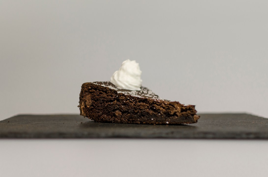
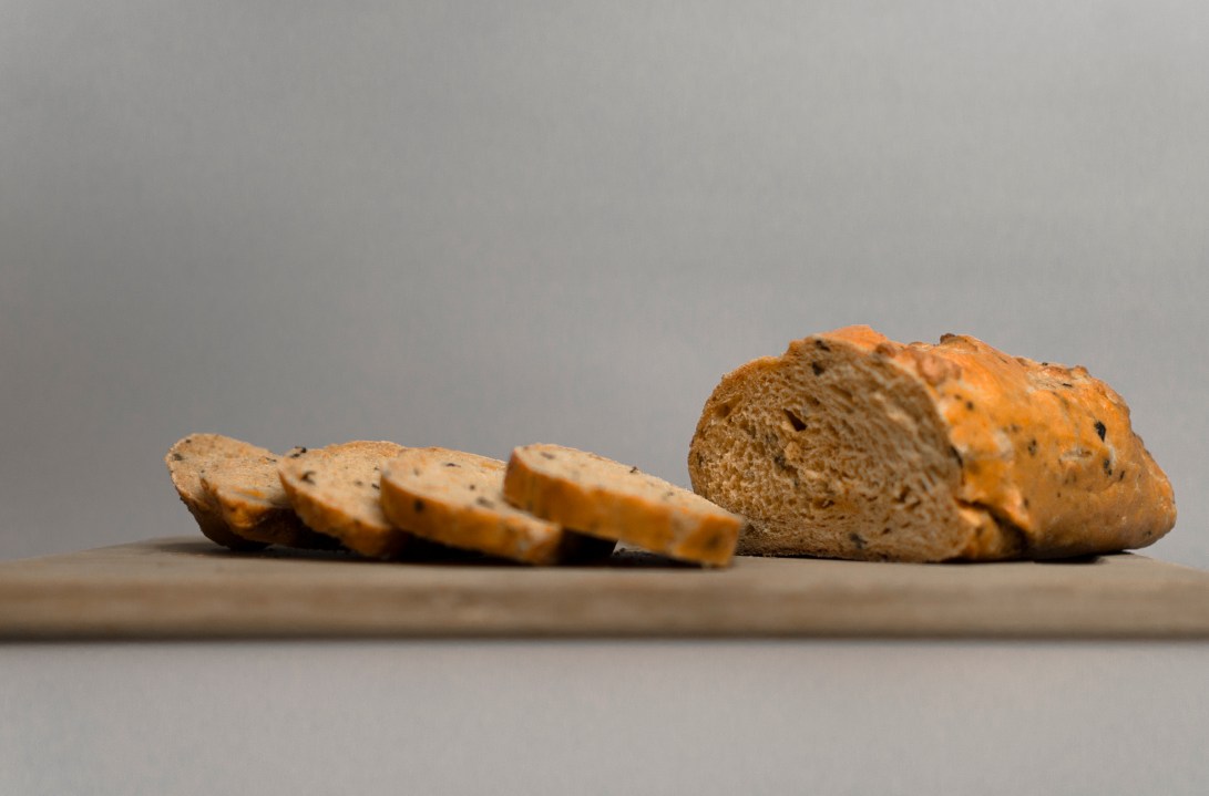
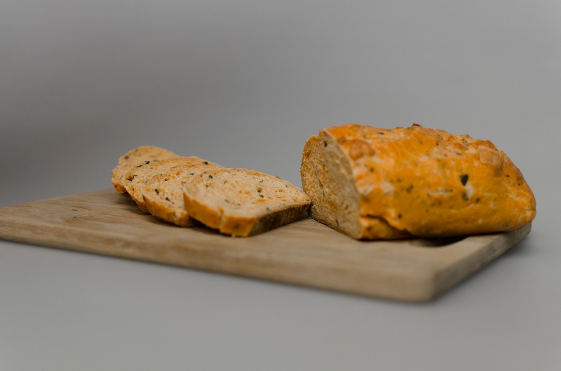
Food Photography Experiment
Editorial Experiment
We were tasked with creating our own editorial spread from a series of stock images of a documentary shoot about ‘Bike Man’, a bicycle making company.
Here is the result:
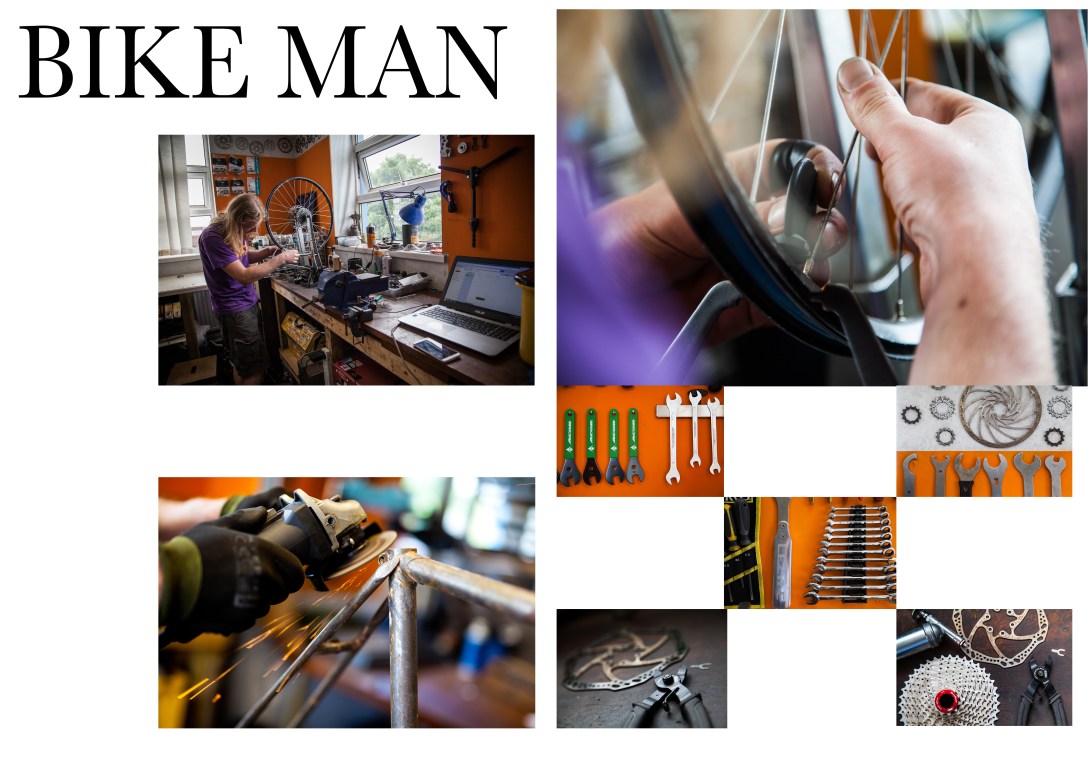
I was a little confused to begin with on this one as it’s the first time I’ve attempted to organise the photos within an editorial. I had seen many in class and was very quick to comment on any apparent shortcomings in those I was shown, however when it came to it, I had a bit of difficulty in arranging the images in an interesting way. After some help I got a bit more creative and found a way to both emphasise the important shots and arrange the lesser ones in a slightly more varied and interesting way. It seems like a simple enough thing to do, but in practice is actually relatively complex.
Idea
I don’t feel particularly confident in my abilities in either aspect of this project, but I’d say that my best option would potentially be the advertising side of things as I think that might play to my strengths a bit better with coming up with slogans and whatnot. I’m going to be advertising the Welsh whisky company Penderyn, and for this I will be researching various adverts and photographing styles of any beverage in a bottle to help me along with my ideas and techniques.
Peter Falk Chivas Regal

I like this style of advertising by Chivas Regal because it’s amusing, it cuts straight through the things a lot of people don’t seem to care about i.e taste. It just comes out and says, using Peter Falk (Columbo), exactly what the product is known to do, this witty honesty is likely to cause the consumer to buy the product simply because the advert is funny, especially as they are already likely to know about the drink.
Mat Trogner

Mat Trogner is the photographer for Allagash Brewing Company. His images are both professional and imaginative, as he shoots both studio and environmental promotional photos.
The studio shots as seen here are obviously very well done and the lighting is expertly positioned, and only appears to be hitting the left side of the subjects. Whether via editing, studio manipulation or likely a mixture of the two, any unwanted reflections have been eliminated and the result is a polished and flawless product that is perfect for advertising specific beverages on a website.
Tyler Shredkowski

This shot by Tyler Shredkowski is simple and elegant, it successfully and subtly utilises shadow to draw the focus to the name of the beer. This helps create an artistic image with what he had available especially seeing as the can is almost devoid of intrigue apart from the writing. It gives the beer a sense of mystery as it appears to be hiding in the shadows.
Kevin Hobbins

This shot by Kevin Hobbins is a simple yet powerful image. It uses a very shallow depth of field combined with limited light on the subject and the wooden surface. The spotlight on the can causes the metallic dark colours to contrast just enough with the pitch black behind it to create a mysterious yet punchy effect. The only thing I would have done differently in this shot would be to have zoomed in on the can a little more as there is a lot of unused space (which may have been Hobbins’ intention) but I’d prefer to fill the frame with the subject.
Casey Atwell

Casey Atwell is a photographer who shoots for various beer companies in the North Carolina area. His shots are very dynamic, and they jump out at the viewer, this is a quality I would like to emulate in my work. Again the use of props to surround the beer is evident, and as I previously stated, this definitely adds to the image in a very positive way as it makes it much more visually interesting. The light is once again manipulated perfectly to illuminate the subject in a subtle, yet profound way. In this shot the rule of three’s is applied in the lighting on the bottle, which almost gives it a striped effect.
Penderyn Whisky Advert Shoot


In an effort to make the most of the unique scenery caused by the snow, I headed out to the woods behind my house with a bottle of Penderyn (with nobler intentions than most in that situation).
I decided that the snowy landscape would not only be aesthetically pleasing, but could also be used to contrast with the red dragon on the bottle. I also, perhaps unintentionally at the time, took a leaf out of Coors’ book with the icy setting, now I know that being freezing cold isn’t paramount in terms of whisky, but I did always like the image of the glass bottles sitting in the snow.
I feel like some of the shots worked better than others, partially due to the light situation, and the angles from which I shot them at. I do like the close up shots of the label, however upon reflection it would have been infinitely better had I not inadvertently cut the dragon’s head off. The full bottle ones on the fence were also quite good as they include the whole bottle and the aesthetic is one I definitely like with the snow in there.
Penderyn Studio Shoot
For the advert, I definitely need high quality studio shots of the bottle, and to do this I headed to the studio in college.
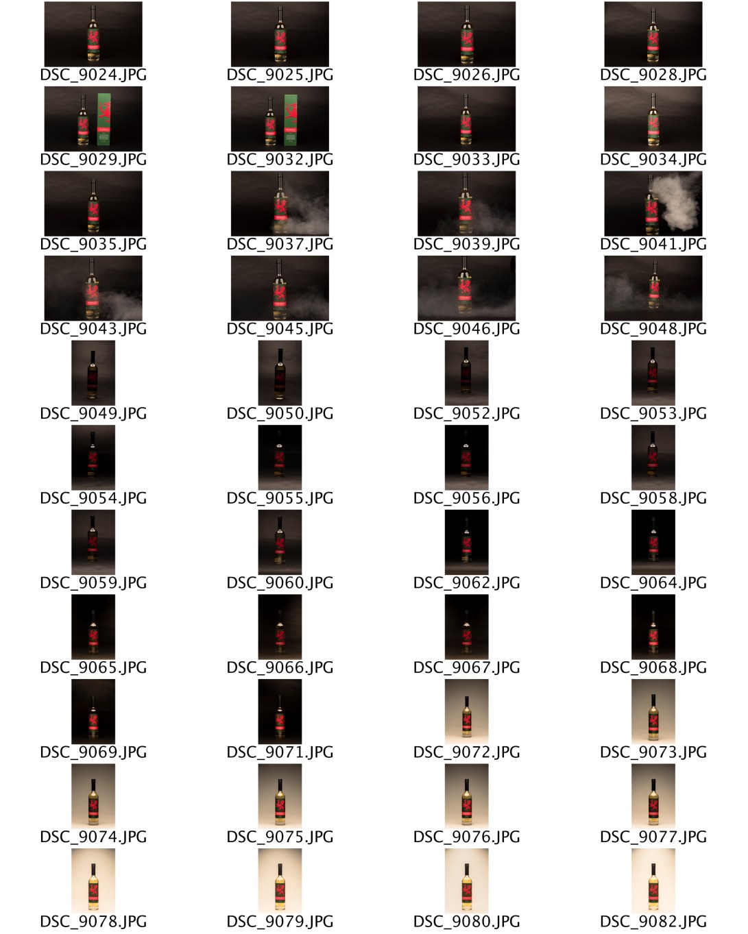
I started off with a black background to see how the images came out that way, and while after a bit of tinkering with light blocking and settings on the lights there were some decent shots, there were none I really felt I could use as the light was reflecting off the bottle in two places (because for some reason I used two softbox lights) and it was just too dark. I even tried making a more atmospheric shot by blowing (perfectly harmless) smoke at the bottle.
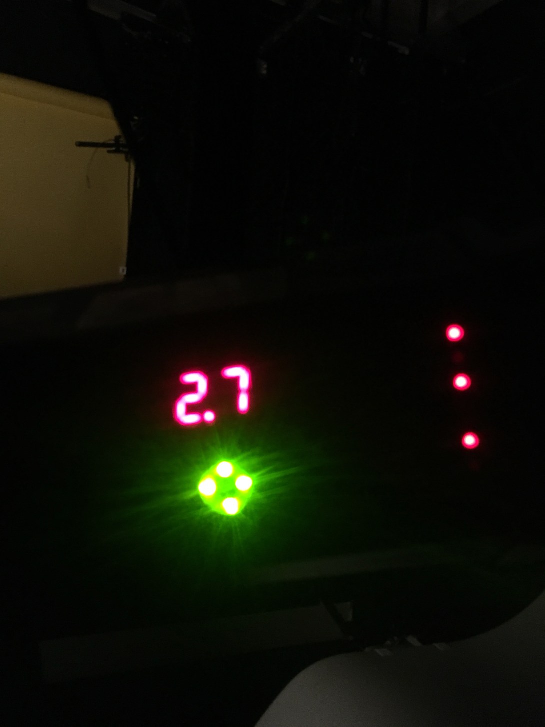
This was the evolution of the setup I was using for the black background.
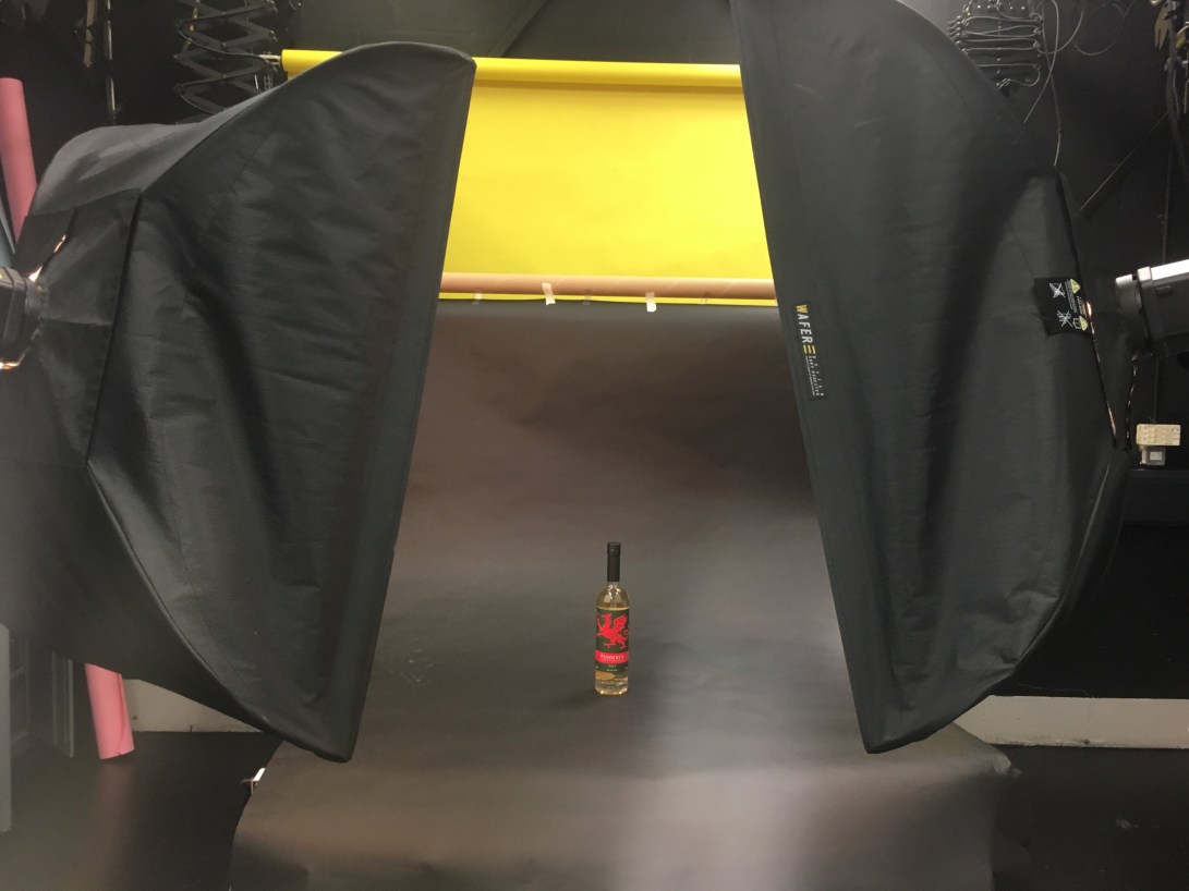
This was the original lighting setup I had which included two softbox’s and created the wrong level and direction of light, it also produced two rectangular light reflections on the bottle which didn’t give it the look I was hoping for.
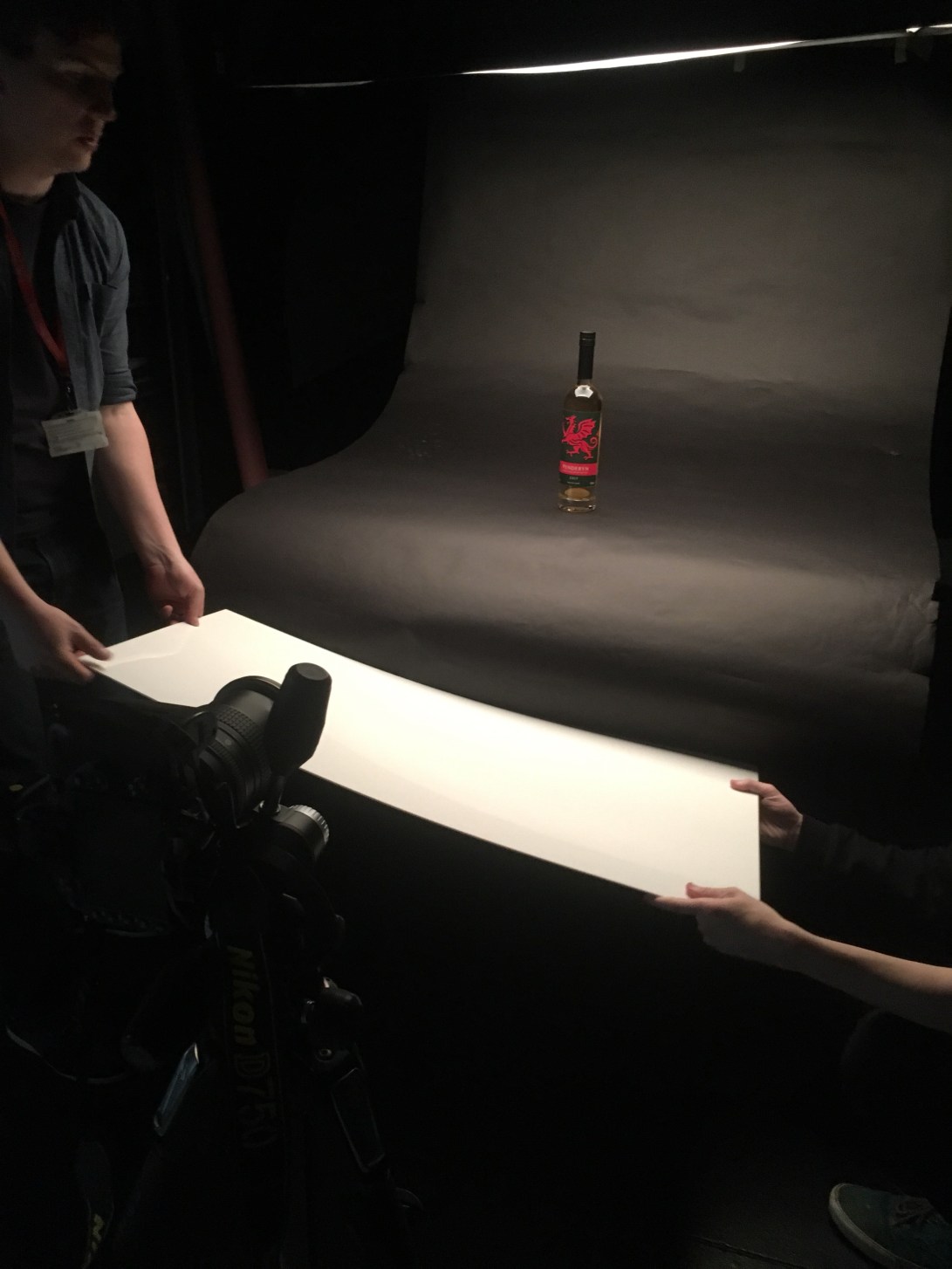
I had a bit of assistance with the shoot including the blocking off and reflecting of light using the board in an effort to illuminate the foreground and darken the background.
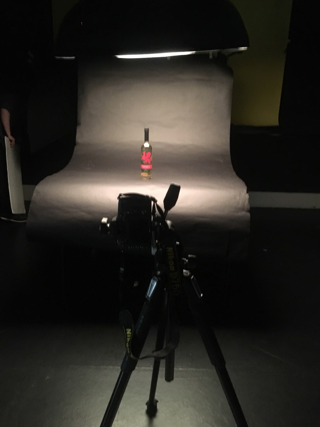
My final setup with the black background, the one softbox is positioned directly above the bottle to not cast any shadows and have a symmetrical reflection of light. It bathes the product in light equally rather than having a shadow on one side, which makes it far better for use in an advert.
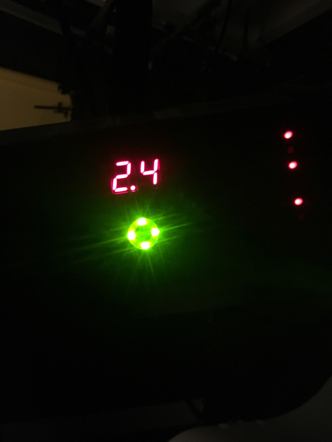
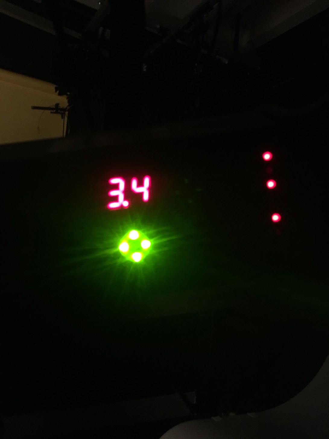
These are the various lighting settings I used, I eventually settled on 2.4 as it gave just the right amount of illumination without giving off a glare on the bottle, this made it look more professional.
A Bit Of A U-Turn
I’ve decided against the idea of doing an advertisement as I have no experience in actually creating an advert and I want to be able to make the best final product I can. I’ve already made a two page spread which is probably better than any advert I’d make and I think I can do even better, so this is my best chance of having a hand in I can be pleased with.
OC Surf & Sport

Although I need eight images to create my spread, I like the idea of the photos being incorporated into the design, like here with the angled shaded areas. It gives the pages a dynamic feel because the angles are seemingly random, and then the image filling one of the areas is of a man swimming, which also gives a sense of movement and things happening, obviously in keeping with the article’s theme.
Vogue
This is an excellent example of a single image used as a background enhancing the mood of an article. Obviously we can tell by the text and the font that this is a somewhat dark article (or at least intended to look dark), and here we have this ominous figure filling the pages between the words, sort of looking like a hipster Edgar Allen Poe. It’s simple and effective, but not the kind of simple and effective that I can emulate as I obviously have to use eight images and so have to find an interesting way of both arranging them and capturing the mood of what the article is about.
Reveal
This is more the type of image I can reconcile with my brief as it has multiple images arranged in a certain way. This particular arrangement seems quite slapdash, but I can only assume it’s intentional as the shots have been tilted and overlapped, almost like a scrapbook. I may not emulate this style of layout, but it has taught me that not everything has to be the standard straight and formally organised in these editorials.
Editorial Experiment #2
I decided to try my hand at making an editorial spread again to experiment with different sizing options for the images because my first attempt included a lot of larger photos, which can be a good way of doing it, but I wanted to see how a slightly more subtle approach would work.
I used the images from a shoot I did at Myddfai to create this spread.
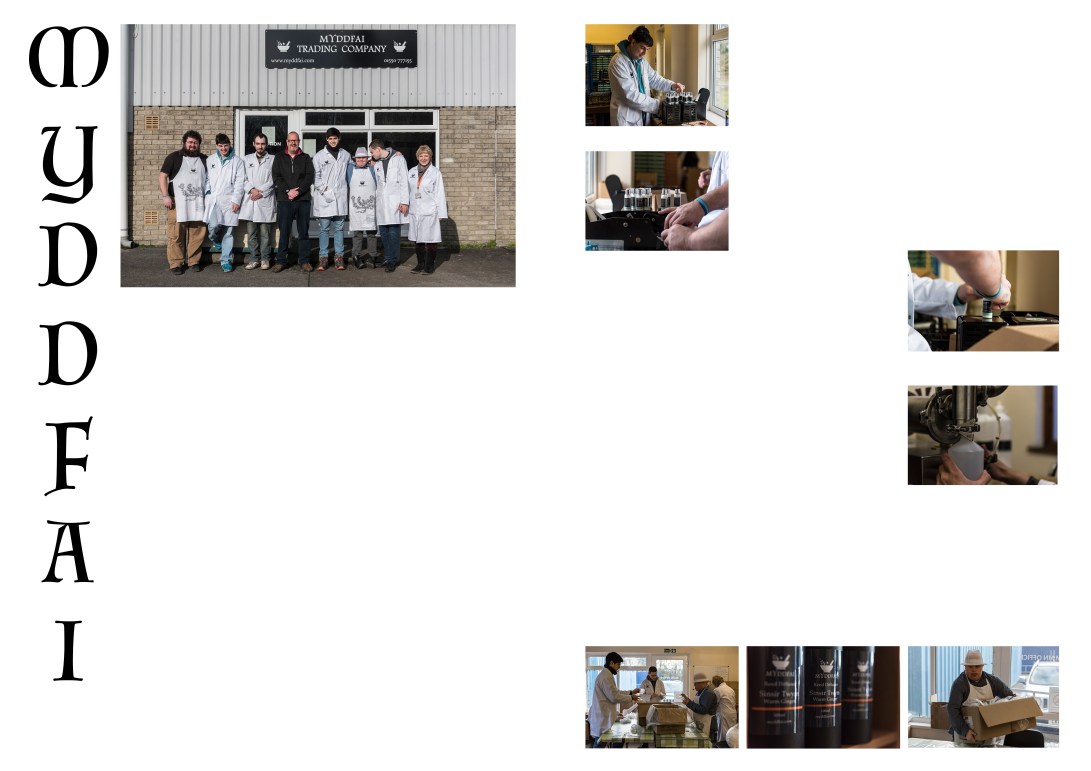
Here I have used mostly smaller images and arranged them in a way that allows for captions and a few more columns of writing than the last one did. On the second page I alternated sides that the photos are on as I went down in an effort to not let the arrangement become stagnant, to keep the reader’s eyes darting back and forth, keeping as much of the page interesting as possible.
I used the group shot as a larger photo at the beginning as I wanted to give off the same feel of family and togetherness that I got when I was there, and I wanted it to be at the forefront. I used a Celtic looking font for the heading as it is a Welsh company and it seemed appropriate. I also had the heading going vertically so as to not conform to the standard horizontal style, not that there’s anything wrong with that, I’ve just already done that in the other attempt and so felt a bit of variation was necessary to find the best method.
Rome Article

This may only use one photo that fills one page, but what this spread has shown me is that it is not entirely necessary to fill all of the blank space with writing. In fact, now that I think about it unless it was something I was incredibly interested in, I would be less likely to want to read an article filled with words than I would this style of bitesize column. The page looks tidier and less of a commitment to read to those just flicking through. This is a style I’d maybe consider if I can find the right arrangement of images to make it work.
Tiny Rebel Spread (Final Editorial)
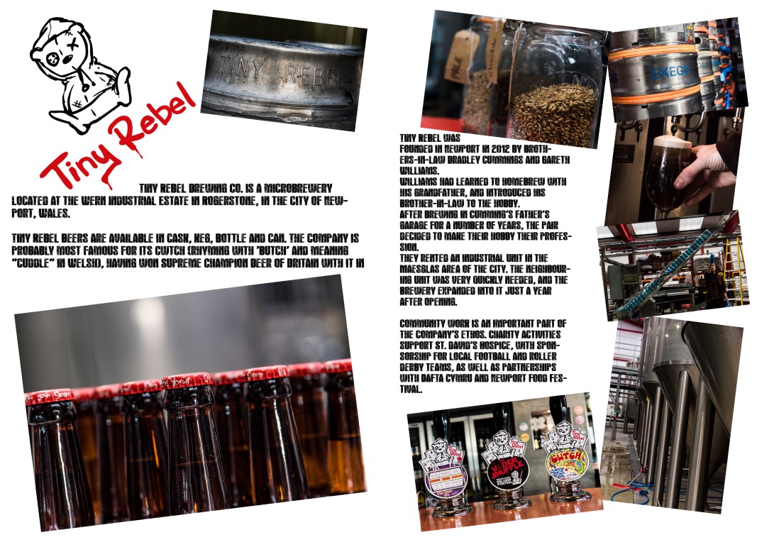
For my final hand in I am centring the spread on an editorial shoot I did at the Tiny Rebel brewery in Rogerstone.
The style I used with the image arrangement is very reminiscent of the ‘Reveal’ spread, with the seemingly sporadic arrangement of images, but I ensured that they were all at least a certain distance from the border and each tilted by exactly 7 degrees. I chose this style because the company itself is quite alternative and somewhat unconventional in its appearance and style, so i felt it wouldn’t make sense to do a standard editorial for it.
The font used in the main body of text is called ‘Rock’s Death’ which I found on ‘dafont’. I thought that although it is a slightly obscure type of writing for an article, I thought it fits quite well with the style I’ve created here and the product itself.
The actual images I chose are a mixture of the nitty gritty within the actual brewing process i.e the vats and the grains, and the finished product, such as the cans going down the chute, the bottles arranged en masse and the most glorious sight in the world, the pouring of a pint. I think overall I’ve done better than I thought I would on this project, obviously not perfect, but if I saw this in an actual magazine, I wouldn’t think it looked out of place. I would have liked to change the background to black and the writing to white, but it would have made the logo pretty much invisible, so I decided against it.
Throughout this project I’ve realised how much goes into an advert or editorial, because when presented with the final product I’ve never really thought about everything that goes into it on the studio shoot and editing side of things.
I feel by trying both advertising and editorial, I’ve enhanced skills related to these that would potentially be useful for me in the future such as product photography in the studio, getting lighting right and how to manipulate light, and editing an editorial in photoshop. I’ve never properly used photoshop for anything other than editing images before, I think this module has definitely helped me gain a slightly broader understanding of the different areas of the software.
Although I may not necessarily want to do either advertising or editorial work in the future, I would definitely feel more confident in what I was supposed to be doing if I was asked to undertake a product shoot in a studio in terms of what lights to use and where to place them in relation to a product. I’d also feel comfortable organising a magazine spread as I now have abetter idea about the different options available to me in terms of the arrangement of the page, especially as I’d not necessarily have to use eight images in the future, I can employ some of what I’ve learned during my research.
Overall this module has helped me improve in elements related to photography that I otherwise would still be a tad in the dark about.
